ITCOFU
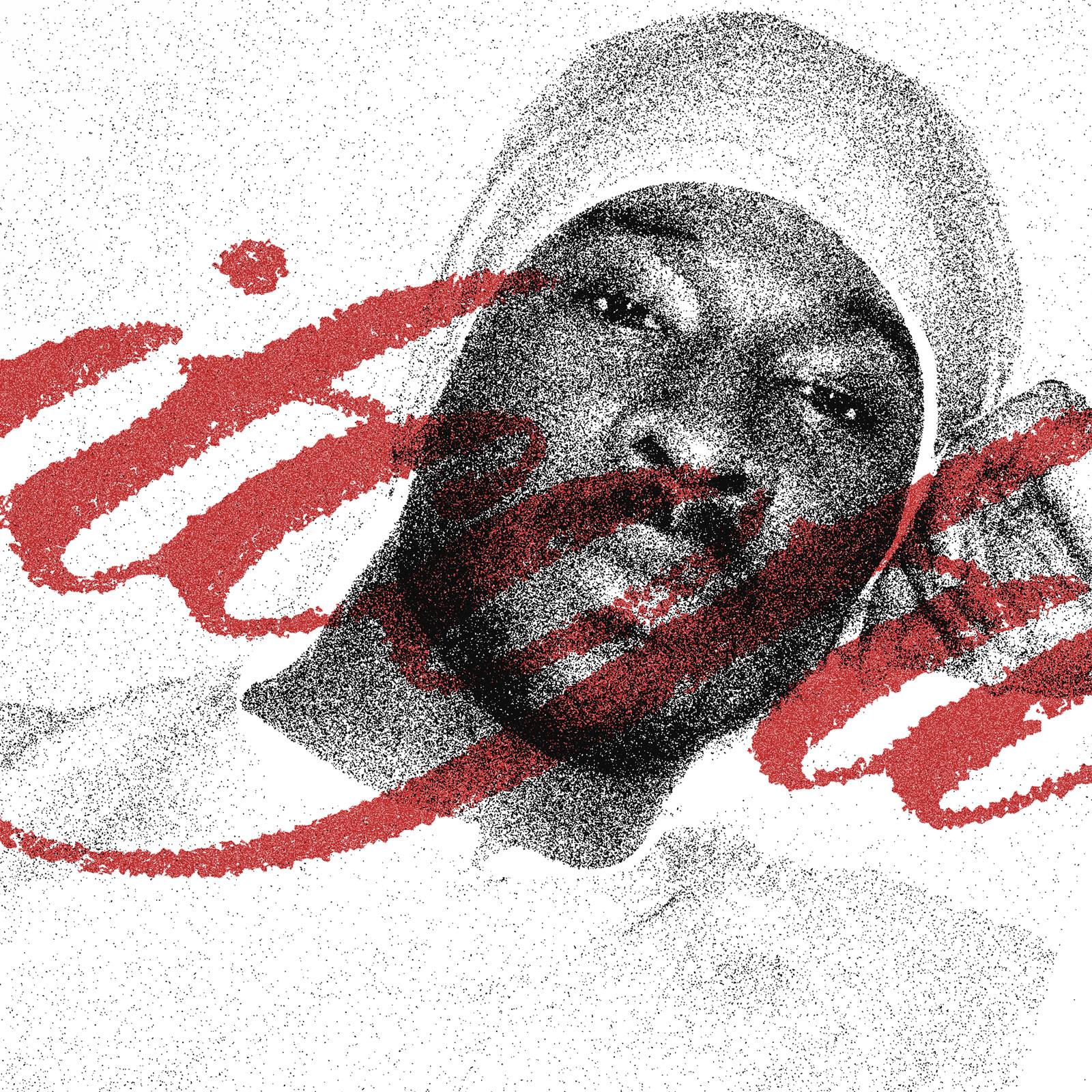
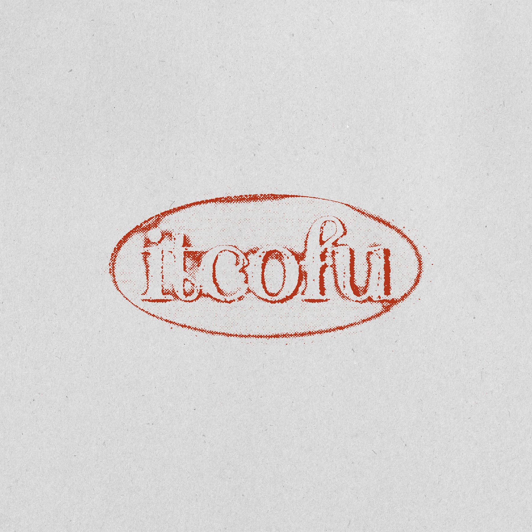
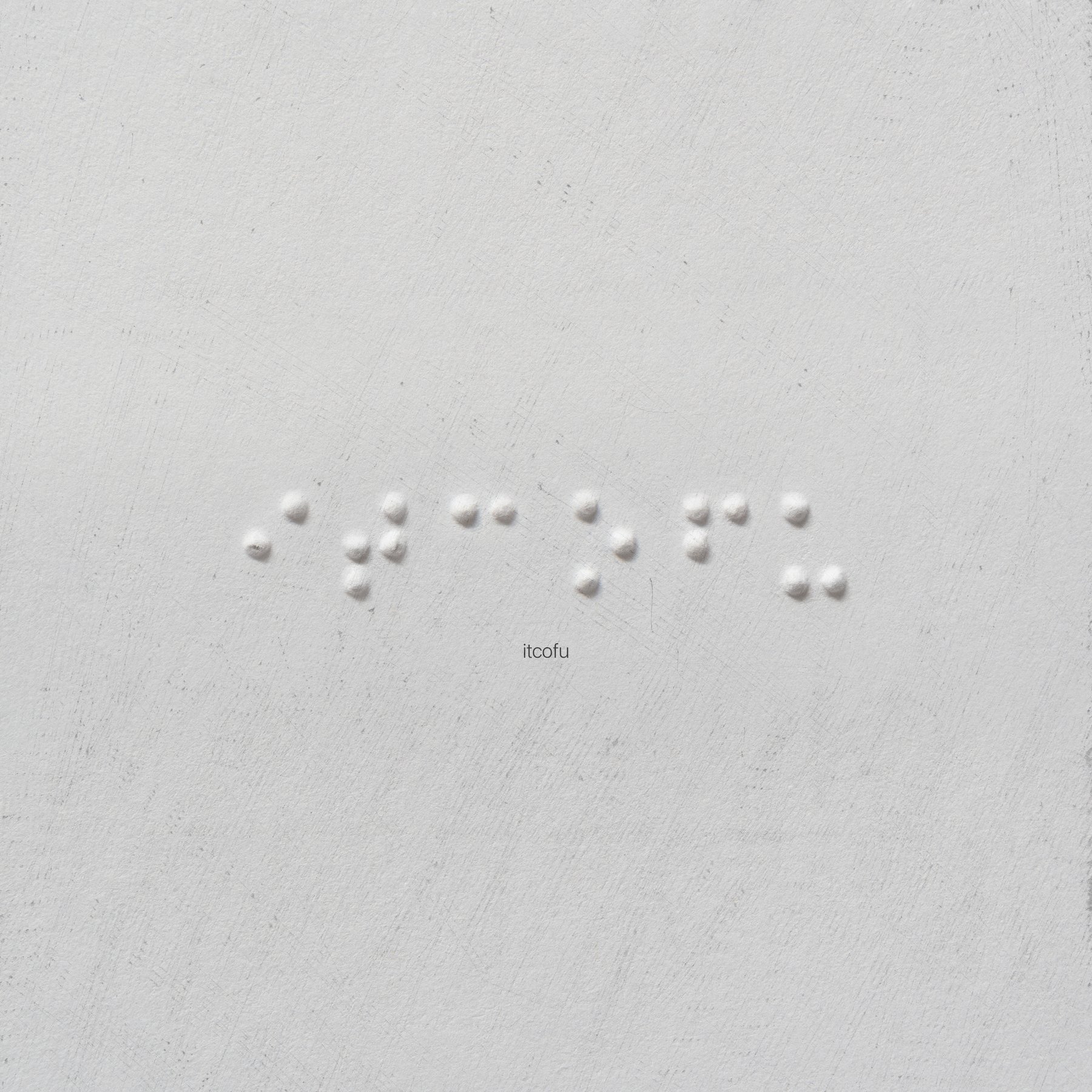
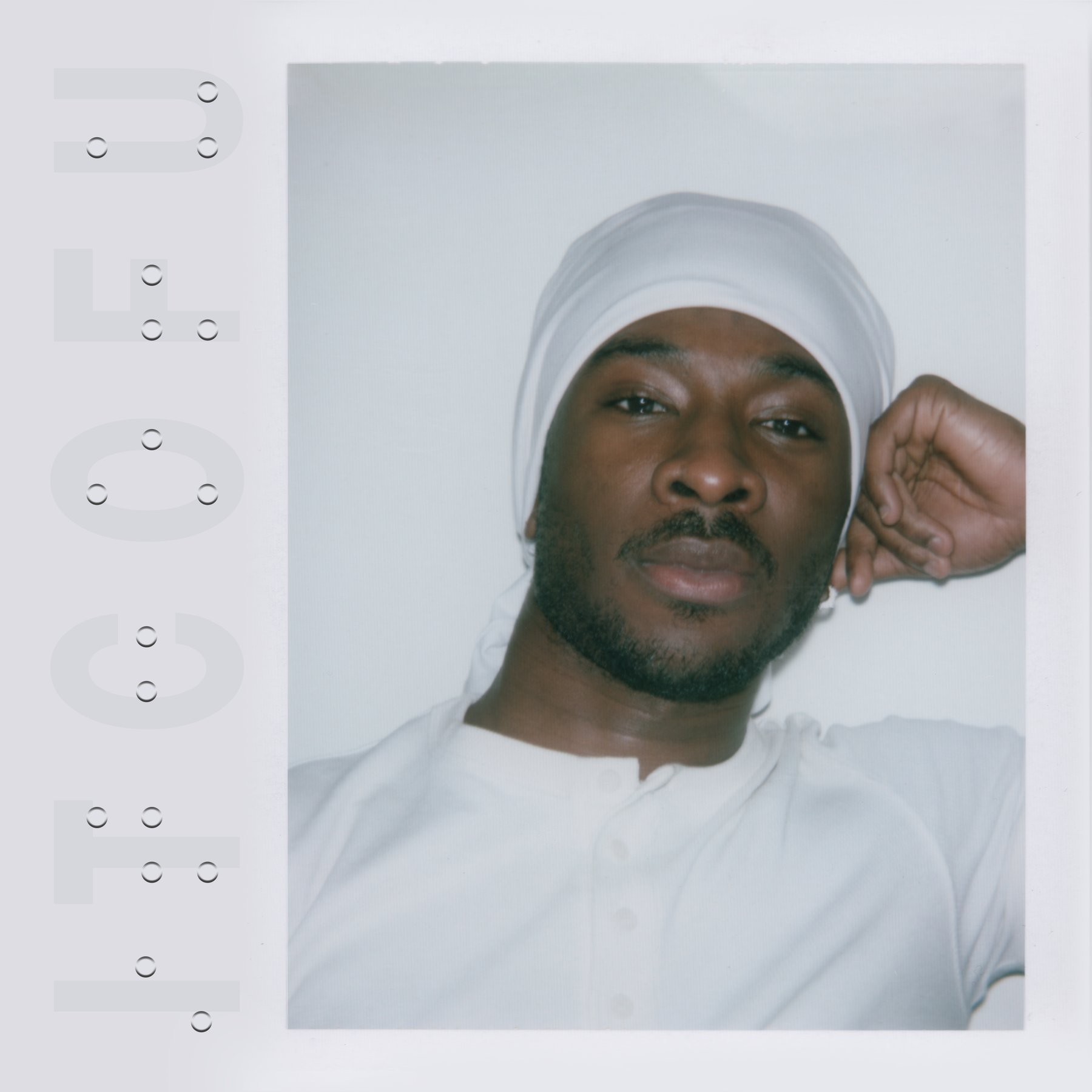
Single artwork as a study in touch — embossed type, stipple and braille pressed into plaster.
Overview
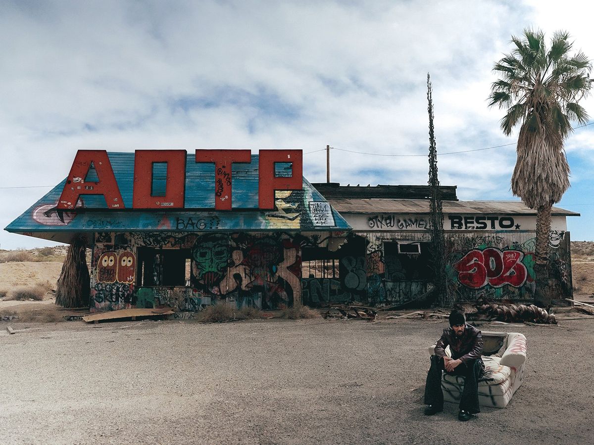
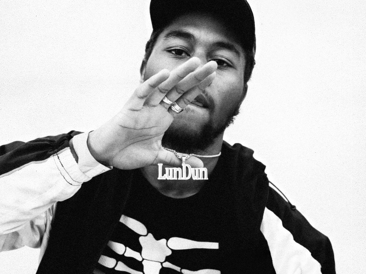
JayO’s ITCOFU translated the song’s themes into a series of tactile experiments.
Alongside the official artwork, the campaign runs embossed typography, stipple illustration and braille — touch as a language of care and connection, drawn from how blind people read the world through their hands. Each material carries the same emotional weight as the record.
Client
JayO
Category
Creative Direction
Deliverables
Single Artwork & Carousel Assets
Year
2026
Credits
Lovell Small — Photography
PAVV — Creative Direction & Design